

February 2023 Market Review
February 2023 Market Review
A deep Dive into the markets, data, and analysis through February 2023

Cartoons of the Week:


February 2023 - In Review
When I think about the market and economy, most of my write-ups revolve around my ability to try and forecast the future.
As I think about this blog moving forward, it is my goal to teach you how to do this.
How to look at the below data and come to your own conclusions.
To do this, you have to think of this process like playing the game of Pictionary.

This game is a fun game anyone can play. It was a TV show in the late 80’s early 90’s called “Win, Lose, or Draw”.
And even highlighted on the TV show the Big Bang Theory.
Just like in the game Pictionary, I try to predict what will happen next in the markets using multiple lines of data that are usually never straight or easy to interpret.
Sure, with hindsight and knowing the answer, it’s easy to know what was being drawn. But when you are in it in real-time and don’t know the answer, it becomes much more difficult.
This week I wanted to lay out the data for you for the month of February. I will look to do this each month moving forward.
Before I begin, please keep this in mind - if the below seems like a different language to you, do not worry. Within the next year, if you keep reading my posts, you will be able to look at the data and understand how all the lines fit together.
My goal for you by 2024 is for you to become a Pictionary data champion.
Let the first picture guess begin.
Recap of February 2023
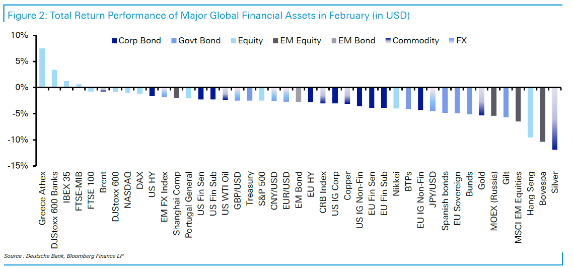
After a fantastic start to the year, February poured a big cold cup of reality on our heads.
What pushed returns lower in the month?
Investors started to price in higher interest rates across the world after they saw data showing higher-than-expected inflation for January.
As you can see below, investors started to price in higher and longer rates by the Fed.

As you can see below, on the PCE (inflation measure the Fed likes to use), we ticked higher in January and expectations and outlook for December also ticked much higher.

It seems we are not out of the grips of the inflation boogeyman just yet.
Looking at the inflation expectation one year from today, you can see it moved from a low of 1.6% in January to 3.5% today.

The key questions moving forward are as follows:
Is inflation sticky? Will it tumble back to below 2% or will it stay high for an extended period of time?
How will the Fed and other central banks react to the inflation data?
How long will the economic growth picture stay resilient?
When will the US employment market break?
Different Market Returns on the Month
Below you can see the monthly returns for January, February, and year-to-date for different markets around the world.

Below is a snapshot of most global markets’ returns for February.
Below is a snapshot of the S&P 500 index versus an average year.
You can see we jumped out to a huge start in January but quickly drifted back to about normal after February’s returns.

Equity Fundamentals - Where it all Begins
The drivers of the equity market are many, but all lead up to two key inputs.
Earnings and the growth of earnings
The multiple you pay for those earnings
If Apple made $1 in earnings and you paid $10 for the stock, you paid a multiple of 10X earnings. If next year Apple made $1.10 and you paid $13.20 for a share of Apple, then you saw Apple’s earnings grow 10% and its multiple increase from 10X to 12X, or 20%.
Multiples move much more than earnings. The multiple investors’ pay is a gauge of investor sentiment in the markets.
Below is a great chart outlining what has driven returns each year. The green line is earnings growth, the blue line is multiple growths, and the white dot is the return of the S&P 500 for that year.

Market Multiple
The market multiple has no real predictive power over the short term but has a very high predictive value over the longer term. As you can see below, the return explained by the multiple of the market over a year is only 9% of the total return but over 10 years, its almost 80% of the total return.

Below is a chart of the long-term PE multiple of the S&P 500 stock index.

As you can see, by 2020, we were near all-time highs on multiple bases. This is why most were able to say with some certainty that in the next few years, we will be facing a downturn and that over the next 10 years, equity returns will be lower than average.
Below is a chart of EPS (gray line above) and PE multiples on the S&P 500. Since December 2021, EPS growth is up 1.9% while market multiples are down 16-18%.

Back in September – October 2022, the PE multiple was about 15X. Today it has moved back up to 18X (blue line below).

Earnings - All that Matter during a Recession
As you can see below, earnings expectations have moved lower since mid-2022. As of today, the earnings number forecast by the street is $222.91.
If the S&P 500 is trading right now at 4,032 and using the streets earnings number, we can back into the current multiple of 18.09X as of today (4,032 / 222.91)

Earnings are what will drive the market over the next year.
If we have a mild recession or just a growth slowdown (soft landing), the drop of 12% in earnings we have already seen combined with the 18%-20% drop in multiple we saw last year may be enough to compensate for any impact felt economically in 2022-2023.
This is why the more people think we will see a soft landing, the better the stock market does.
Right now the street is forecasting a 5% decline YOY in 1Q with a ramp-up for the rest of the year.

Most models that use leading indicators of the economy as their guide show a continued slowdown for earnings (orange line below), while the market is forecasting a bounce (yellow line below).

Credit Fundamentals - The Body that Wags the Tail
Government Credit
Government treasuries again moved high on a yield basis in February, giving back most of their gains in from January.
As you can see below, the highest-yielding treasury today is at the 6-month mark.
This is because of the risk of a short-term default due to the debt ceiling debate.
We would rather look at the 2-year yield, which is at 4.86% today. You are still able to earn more on your money locking it up for 2 years than you are locking it up for 5-,10-, or even 30 years.
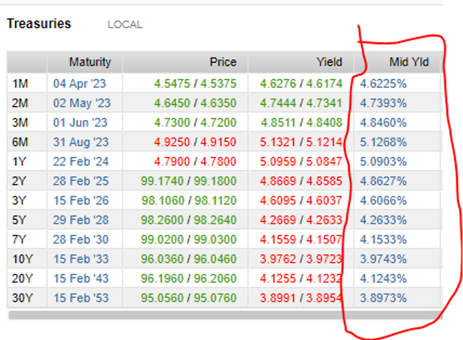
This creates what we call an inverted yield curve, which has predicted every recession since World War II.

As I wrote about HERE, the US Treasury market is the only one flashing red of a big recession on the horizon.
Corporate Credit
Corporate Credit felt the same pain as Government Credit in February.
As you can see below, for investment grade credit, we had the best January on record only to be followed by the worst February on record.

After a 5%+ return in January, the high-quality bond index is back close to flat on the year.
Current high-quality bonds are yielding in the mid 5% range now (blue line below)

When we look at the debt outstanding for high-quality corporations, it really has expanded over the last 20 years, up to almost $8 trillion today.

But if you are worried about the increased debt level outstanding, don’t be (at least not right now).
The extremely low-interest rate environment we have seen since 2008 has enabled companies to issue more debt at lower interest rates, increasing their interest coverage (company earnings dividend by its interest expense).
While debt increased, so did total interest coverage.

As we look forward over the next few years, it will be interesting to watch this maturity wall of debt shown below. It will need to be refinanced at double or triple the rates they are currently being held.
How corporations react to this will be very interesting.

High Yield and Leveraged Loans
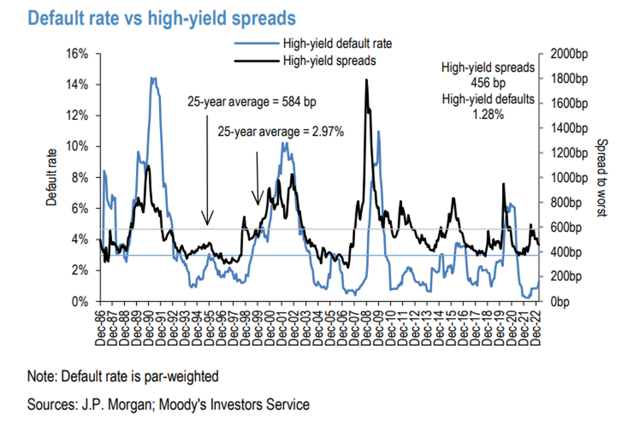
When we look at the high-yield market, we saw yields rise by the most since September of last year, pushing current High Yield yields to 8.93%, or a spread of 456 basis points.
High yield was down 1.27% on the month.

On the other side were leveraged loans, which have a floating rate component. This market did well in February, as rates moved higher. Leveraged loan yields increased to 9.78% with a spread of 545 basis points.
The index was up 0.59% on the month.

February saw seven defaults on the month for a total of $13.9 billion in value ($6.6 billion in high yield and $7.3 billion leveraged loans). This is the highest we have seen since October 2020 and now have default rates sitting at a two-year high.
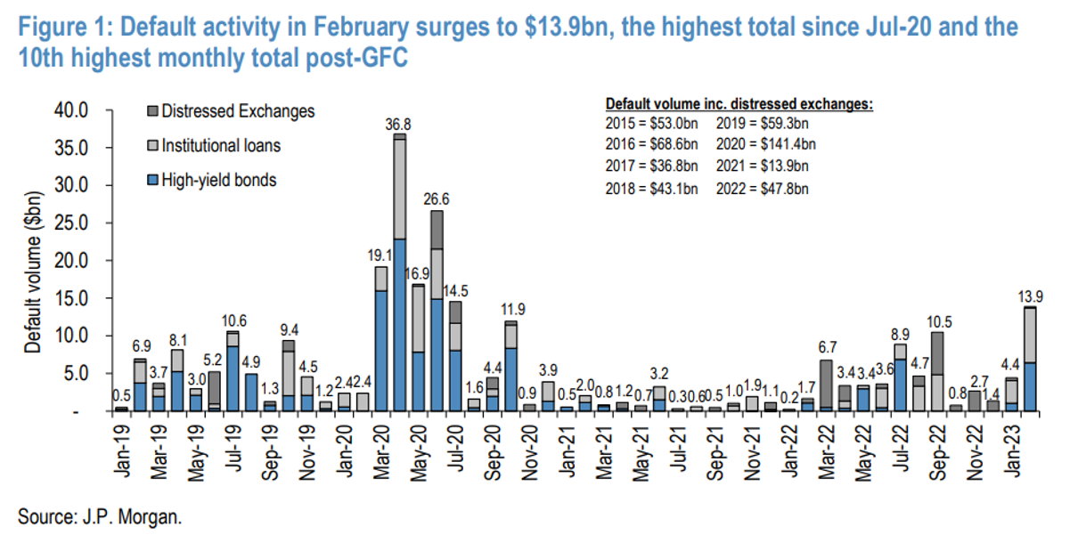

The big default on the month was Diamond Sports, which missed its interest payment and defaulted on $8.6 billion in debt, the largest default we have seen since 2020.
It will be interesting to see if this is the start of a corporate deterioration because of inflation and growth pressures. If this default rate continues for the next few months, expect to see some issues rising to the surface across other markets.
When it comes to debt maturities, we will not see a maturity wall as we see in high-quality debt. As you can see below, high-yield and leverage loan companies have done a fabulous job of pushing their debt maturities out to the late 2020s.

Market Technicals
If earnings and multiples drive the market over the long term, it’s technical that drives the market over the short term.
As you can see below, the S&P 500 is still ABOVE its 200-day moving average. This means we are still in a positive UP trend in the market.

We saw what we call the “Golden Cross” happen in January. this is when the 50-day moving average crosses the 200-day moving average.
As long as the S&P 500 stay above the 200-day moving average on a weekly basis and the 50-Day moving average stays above the 200-day moving average, we are in an uptrend with a positive outlook potential.
Keep an eye on this over the next few weeks. If the market continues to drift lower, it will put our technical positive picture at risk.
Economic Data - Leading Indicators
Leading indicators are economic data points that lead the economy by 2-18 months.
We can think of the government bond yield curve inversion we highlighted above as a leading indicator. The stock market itself is a leading indicator.
If you can get an indication of where leading indicators may be heading, you can have a good insight into the direction and rate of change of the market.
The ISM is one of those indicators. This is a monthly survey done with a range of 0-100. The 50 line is flat growth, with most recessions happening under 50 and most growth outlooks above 50.
As you can see below, on both the services and manufacturing, we dipped below 50. As of February, manufacturing is still below 50, meaning for all intents and purposes, US manufacturing is in a recession.

PMIs usually LEAD earnings growth and economic growth. The biggest influence on PMIs are interest rate changes. As Francois Trahan of Trahan Macro Research recently stated,
“The biggest influence on the direction of PMIs is interest rates. It takes about 18 months for a change in monetary policy to be fully reflected in PMIs and stock prices by extension. Who knows when the elusive bottom for the cycle might be with the Fed still wrestling with the inflation fog of war. It’s clear that it’s not likely in 2023.”
As I talked about last week HERE, we are still warming up. We have not even begun the downside of this economic cycle. We will need to see a peak in the 2-year treasury rate before our clock begins.
Most leading indicators have moved significantly lower over the past 12-18 months. Most are at levels only seen during or leading up to recessions. If these are right, we may see a recession later this year or in 2024.
Economic Indicators - Lagging Indicators
On the other side of the leading economic indicator weakness is the strength that continues in the US jobs market.
The US employment market is one of the biggest lagging indicators in the marketplace today.
And the Fed, which is the ultimate leading indicator, is using this as its gauge of success against inflation. I discuss this paradox in more detail HERE.
Right now we have an unemployment rate of 3.4%. We just had one of the biggest employment beats we have ever seen in January.

We still have 2 job openings for each unemployed person in the US.
The jobs market is on fire. It has never been this good in your lifetime.

One of the best real-time indicators to watch is the weekly initial jobless claims data.
As you can see below, this is near all-time lows.

This tells us that people who have been fired are very quickly finding new jobs.
Historically, we have ALWAYS seen initial claims move higher at the start of a recession.

Mid to late 2022, we were seeing this indicator move higher, only to reverse in late 2022. This reversal was One of the many reasons the market rallied over the last four months.
Will the jobs market ever break?
Only time will tell.
I hope you all have a wonderful weekend….We will talk again next week.